
This great Deathwing banner comes from Wienas. He emailed me the other day to ask about fixing a small problem he's having.
Here's my tutorial he followed: Cardstock banners.
If you look close enough, you can see the raised edge where the image was added to the larger banner shape. While it doesn't stand out too bad, it's just enough to cause problems and if you're going through this much trouble, you want to make sure it comes out the way you want.
In an effort to help him fix his banner and prevent it from happening again, here's what I would try to do:
First, his banner... unfortunately, there's not too much that can be done. The one solution I would try is adding some linework where the raised edge is in order to camouflage it.
For future banners, here's what I would do to prevent the raised edge from standing out as much.
If you look at the Black Templar banner above, you'll see a red line around the "image." This painted line goes over the raised edge where the paper image is glued to the banner shape and makes the feature a little less obvious.
To do this means you have to plan to include your image in one solid box from the start.
But the problem is made worse when you dont have a "box" to put your image in or you are doing more of a vignette type image.
In this case, you have two choices:
1. Make the paper the image is on large enough to cover the whole banner so you don't have the raised edge. Just make sure to glue the paper image to the banner really well, you don't want it peeling apart later on.
In the example below, the painted black line hides the raised edge along the top and sides, along the bottom of the banner though, the image paper extends all the way down.

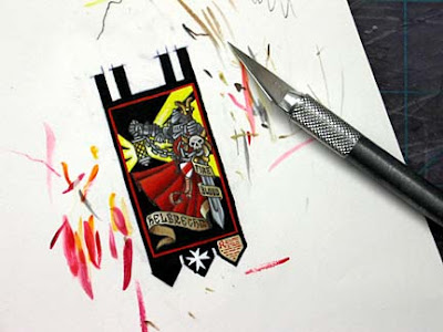
2. Or you can cut the paper image out along the edge of the actual image. This can take a little more time depending on the detail you have to cut around. I did that on the example below.
On the sides and top, I follow the white line (it's painted on to hide the raised edge) and along the bottom, I follow the hilts of the chainswords and the actual flowing scrollwork itself.

I hope this helps some, and maybe this will get you thinking about some more detailed images to add to your banners.
