Pre-Heresy World Eater assault marine


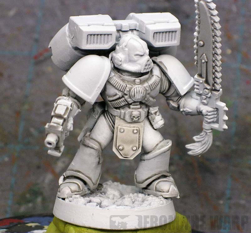
I set out to paint this Pre-Heresy World Eater space marine with the sole purpose of practicing how to paint their chapter symbol. I've always liked the blue and white scheme and I've been wanting to do a miniature in this color combination forever. When I saw what Mordian 7th did on his blog with his pre-heresy World Eaters and how he broke down the chapter symbol, I had no more excuses.


Once I had my model all painted up with the base colors (prior to any weathering) I sat down to try my hand at the process Mordian 7th had laid out. I didn't stray from what he had, I followed it to the letter and it worked perfectly. I may have used different colors, but the process he came up with was spot on. He says he got his inspiration from the articles I posted here about breaking icons down into simple shapes, but that only goes so far.

There comes a point when you have to figure it out and all the theory in the world won't get your mini painted. He did a great job with this one. I even tried it in three places on mine just to make sure I could pull it off.


Here's the process he lays out for painting the symbol. I've got nothing to add to it. The only thing I altered were some of the colors since I used what I had. In the end, if I were to do it again, I'd make sure to use a slightly different blue for the ocean in my chapter symbol. That way, it stands out from the blue on the armour at first glance.


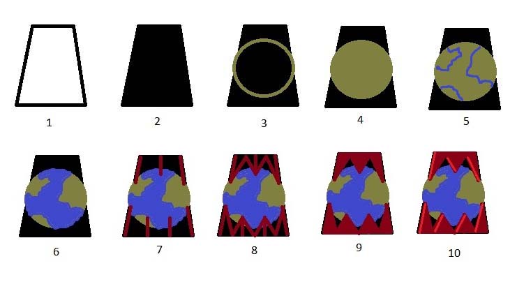
World Eaters symbol breakdown by Mordian 7th

As a side note, this model was simple to paint even with the white. I used the same white technique I used on my White Scar model. Start out with a white primer, wash with Secret Weapon Soft Body Black and then touch up with white. Even with GW introducing all their new paints, this still works like a charm.


If you're into Pre-Heresy World Eaters or want to see what it's like to work with lots of white, swing by Mordian 7th's blog and take a look at the great World Eater stuff he's doing.

And for you savvy readers, you'll notice a deliberate lack of blood splatters on my model. I wanted to see if I could do a convincing World Eater without any blood. I did add some red weapon markings to his chainsword and gave him a red tassel on the hilt of his chainsword for good measure though.

Make sure to check out these posts as they might help:
You need to start with a CLEAN model before you weather it
The trick to painting small and complex iconography


Ron, From the WarpIf you've got any questions about something in this post, shoot me a comment and I'll be glad to answer. Make sure to share your hobby tips and thoughts in the comments below!

17 comments:

  1. Looks fantastic! It seems you've got the chapter symbol down no problem.

    I know it's not really the point of the post, but I love the chainsword. The red stripes on either side of the larger stripe look great.

    Krisken of Scratchbuilt 40k

    ReplyDelete
  2. Love the weathering, looks fantastic

    ReplyDelete
  3. Man that is stunning, what you can see of the face looks incredible and the chapter badge is immense!

    ReplyDelete
  4. Nice, the freehand is awesome.

    ReplyDelete
  5. This model is painted really well. Fantastic weathering.

    How you've modelled the upper body makes his legs look super-short though. But I don't think this is your fault. GW's space marines aren't well proportioned.

    ReplyDelete
  6. Very cool. I alway slike seeing how others break down their freehand into shapes, and the order in which they do so.
    Good on you for doing a World Eater that's not soaked in blood. Folks seem to like to do that, and it's so hard to pull off convincingly that most end up making it look terrible. Plus, he'll be plenty blood-soaked after he carves though the opponent's army on the tabletop!

    ReplyDelete
  7. Absolutely gorgeous work, Ron! I really dig the red striping you added to the chainsword - I'm going to be swiping that idea for my own assault marines. Really glad to see my ham-handed attempt at breaking down the WE symbol worked for you - keep up the fantastic work!

    ReplyDelete
  8. As with everything you paint, this looks gorgeous!

    ReplyDelete
  9. Ron how do you do it? time after time mate, quality work great blogg, top work mate!!!

    ReplyDelete
  10. Heeeey! that´s not pre-heresy jump pack! :D :D :D

    nice looking model! as always, freehand is excellent!

    ReplyDelete
  11. Whoa, a World Eater on FTW: What an unexpected surprise!

    He looks awesome! Your gritty realism always manages to make the models look like real beings instead of mere playing pieces. As always, the weathering is top notch, too!

    No if you would only do a post-heresy WE... Well, one can always dream ;-)

    ReplyDelete
  12. How is Soft Body black compared to Nun Oil?

    ReplyDelete
    Replies
    1. Personally I found nuln oil was very dark once dried, soft body black seemed, well.. Softer, a bit like the old badab black, it's much nicer to work with than nuln, but nuln still has its uses :)

      Cap'n Stoogey

      Delete
  13. Ron, this is beautifully done. I love how weathered everything is.

    ReplyDelete
  14. Hi Ron,

    As many people have said this is once again an excellent miniature!

    I'm just wondering, I love how you weather models but would you be able to re create an effect like this with paints? I'm not so sure I want to use powders but i still really like the look.

    Appoligies if you've already covered this!

    ReplyDelete
  15. Thanks guys!
    I appreciate the kind words.

    Tim: I think it might be the front apron armour thingy that makes his legs look stubby. I never realized it until you said something.

    TheRhino: I wanted to paint one without any blood to see if I could give him the same menacing look as they have with the blood all over them.

    Mordian7th: You symbol breakdown worked perfectly for me.

    Perun: I know, but it's the only jump pack I had available.

    KrautScientist: A post-heresy one now? Let me see what I can do.

    Will Wright: Soft Body black is more of a darker grey and is much... softer for lack of a better way of explaining it. It acts a bit more like a thinned paint and flows super well. The GW Nuln Oil is a bit more harsh over white. It's a bit more heavy handed looking in the end.

    I like the Soft Body Black since it have the ability to use multiple layers if need be and it has a bit more of a cool look to it (as opposed to warm). It relates better as s shade color.

    ieuan: I have not tried to do this without powders yet. It might make for an interesting experiment though. I may try it to see what the difference is.

    ReplyDelete
  16. I didn't know Bane was to become a World Eater haha! Even so, a fantastic model! Exquisite!

    ReplyDelete

If you've got a relevant tip, trick or link, make sure to include it in your comment for the rest of us to check out!

Note: Only a member of this blog may post a comment.