With my interest in gaming renewed by finally letting go of Deathwing and picking up Novamarines as my new chapter, I decided to paint a test model up to see how much work I was looking at with the split color scheme these guys have.
Turns out, it's not too bad. Sure it takes a bit longer, but it doesn't feel as painful since part of the model is light colored and part is dark colored. It breaks up the monotony of painting all one color on a model.
Since this guy is a test model, I've only include two pics here. That and I cannot find my other pics of him to save my life. I honestly don't know where they've ended up. As for the color scheme itself, I used the images I found in IA9 for reference.

The things I like about this guy
I like the split color scheme. Looks very, very cool once done. I like the blue right now, but I fear it may be a bit too dark. Either that or too saturated, I'm not sure which one yet. I think I'm going to lighten/desaturate it slightly on my next test model.
I love the red helmet and how it came out. It pops on the model. The gun case came out well too. It's not the standard black color. This time, I copied the color plate in IA9 and used a blueish color for the gun casing. Makes it stand out from all the rest of the metal on the model.
I think I did alright with the weathering. It's two different approaches over light and dark colored armour. You can't do the same thing on the white that you did on the blue, it won't work. I want to be able to use my weathering powders to tie the model to the base and make these guys look the part. Which leads me to what I don't like.
The things I don't like on this guy
I don't like the white armour. It looks good for white, but it needs to be the bone color I used on my Deathwing. These guys are more bone than they are white and if I make their armour bone, the white veteran helmets will stand out like the red one does now. That's what I want. White helmets on my terminators. I never had that before and I want it on these guys.
I'm not sold on the base. I love the base itself, but the color scheme doesn't do it for me. I think I'm going to go with something darker to make the model stand out. Darker and reddish brown. That sounds cool. I'm keeping the style of the base, just changing the color scheme.
The biggest decision though is the shoulderpads
The one thing I'm really struggling with is do I go with the standard terminator shoulderpads or do I go pre-heresy looking (roman style). I'm leaning towards the pre-heresy style just for the looks alone. Apparently these guys have lots of that old equipment according to the book. That's kinda cool.
I'm curious to hear what folks think of this guy. He needs some work, but for a test model, he's helped me sort out a few issues already and that's the real purpose of doing test models anyway.
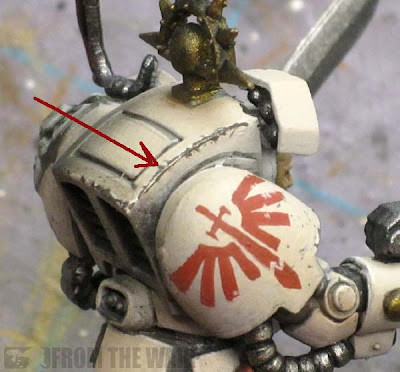
UPDATE: Weathering over light and dark colored armour
Since I mentioned it in the post and a couple of folks asked about it in the comments, I've included a link to the previous post where I talk about applying weathering (pencil) over light and dark colored armour. You can't treat both the same when using a pencil and it wasn't until I tried to do it that I learned about it myself.
Weathering with a pencil over light and dark colored armour
(this actually applies to weathering in general as well)
The same thing applies to regular weathering as well. Over light colored armour, things like powders and washes will appear much quicker and be stronger than over dark colored armour. You need to be very careful when working over white and light colored armour that you don't go overboard in your initial application. It's much better to apply very little and build it up than it is to try and remove the excess.
Here's the tutorial on how to paint this quartered scheme.

Would love to see a walk-through of this model. Love the color and the weatherings on it.
ReplyDeleteHave also started to look at the Badab war. To bad the ones with the lion are on the "bad" side :)
Wow...i don´t know much about 40k but this guy looks as if he is part of an elite army or smthing? the diferent colors makes him more "elite-ish" than the regular marines... like the look a lot.
ReplyDeleteMaybe the base should a bit darker :)
This is a great model. I actually really like the white too, it looks excellent against the blue. I'm with you on the base though. Looking forward to seeing the changes.
ReplyDeleteExcellent model. I think you could just go with a the white, but I see what you mean about using bone. As for the base, maybe a brick color, like a terra-cotta?
ReplyDeleteGreat job, especially the freehand. I agree with you about the white armour and the base. Hard to say regarding the blue, certainly the powerfist casing is vibrant enough. It's really hard to criticise such a neatly painted model though!
ReplyDeleteIt's not as warm or contrasting but I think a slate coloured base would also work.
If you change the white, will you need to adjust the crux terminatus to make it stand out more?
Looking forward to seeing more!
The freehand painting on the power fist and leg are fantastic... Interesting back story about liking the deathwing too much to play them :-) too much of a vested interest
ReplyDeleteThis comment has been removed by the author.
ReplyDeleteThat's a great looking Novamarine, and I agree that the freehand on is fantastic. I'm also happy to hear that you're interested in gaming again. It would be great to see these models hit the table.
ReplyDeleteI would be interested in hearing how you altered the weathering between the blue and white areas. I've never considered how to alter weathering powders between different base colors.
i've never been convinced by the halved and quartered paint schemes for marines - i sort of see where they're comming from but i've just never been sold on it.
ReplyDeletethat said this scheme works well for me, wonder if it's the red helmet setting it off? i guess the fact its a great paint job doesn't hurt! ;-)
and is that an AoBR termie? glad i'm not the only one that consigned them to the "paint test" bucket!
Etchy: I'll do a walkthrough once I get my new GW colors and can sit down to do a proper test model.
ReplyDeletedancing platypuss: I agree, the base needs to be darker to make the model pop. It's one of those areas I'm still struggling with.
Lifeless Loser: Thanks. The white is good technically, but I'm going to see if I can match the chapter colors better.
Hudson: Brick... I like that a lot.
Anonymous: If I change the white to bone, I think I may leave the crux the way it is. If for no other reason than that is what they had in IA9. I like the contrast of the warm crux against the grey of the chest eagle too.
Donz0: I just get hung up when I play them. I'm looking to recapture the carefree fun I've managed to grab a hold of when playing other armies before.
TheRhino: I appreciate the comment. I think you brought up a good point about some other colors being introduced into the base. Would love to see how you've done it with your Ultras.
Codicier Ignatius: No problem. I actually have a post talking about it. I ran into the problem when I was doing pencil weathering on my Deathwing.
Ron, Pencil weathering over light and dark colored armour.
Matt Farr: Quartered and halved can look odd. I agree there. I think if I can give this guy the grim dark look, I might be able to pull it off.
I don't remember if this guy is AoBR or not... he probably is. I grabbed him since he is not being used in my force and was in my bits pile. If you don't make the army cut, you're free game for anything else.
Bone white is a good choice. The blue is already a cool color, while bone white would be warm: instant contrast. Good luck with this new army!
ReplyDeleteIt's pretty elaborate for a test model. How big of an army are you planning on doing and in what time frame? I did a 'halves' color scheme when I did my Bezerkers, half Khorne colors, half Chaos Renegade DIY Chapter colors.
ReplyDeleteI think doing the helmet a different color or having models without helmets really ads something to marines (Chaos Marines), I did some terminators with white (very off white) helmets and I really liked it, never knew it was a rule in the Astartes, never really played loyalists. I'm more of a whatever looks cool and doesn't break the rules kinda guy.
Now to find links...
http://www.flickr.com/photos/muskiemckay/5951663302/
http://www.flickr.com/photos/muskiemckay/5476785693/
Hi Ron!
ReplyDeleteI thought you were going ultramarines?
Anyway, i'm glad you didnt, i really like these.
The split scheme looks very good, and i think your colour choices are spot on. it looks really well worn in and gritty with the weathering, a look i really want to acheieve myself!
Gun case is not my cup of tea, but the power fist detailings look very good.
Agreed on the base, i dont think the aesthetic of that companys style of resin base match up with 40k's style, but thats a personal thing.
Look forward to more Ron!
Looking good Ron! I agree that a bone white may look better than the bright white, and that a darker base would make the model 'pop' a bit more. With the Novamarines being a sucessor chapter I'd argue against the heresy-era look (as they weren't around during the heresy), but on the other hand the argument could be made that they've retained some of the Cataphract style terminator armor from their parent chapter, as well. When all is said and done, always go with the 'Rule of Cool'! Looking forward to seeing more - keep up the great work!
ReplyDeleteThink he looks awesome! shame to know that the Deathwing are gone. I think you should leave the white as it is. Nice to see a painted marine from the Badab wars book. The freehand is excellent aswell.
ReplyDeleteAnon: Thanks! I think the bone will darken down the mini overall as well as contrasting against the blue.
ReplyDeleteMuskie: I suppose it is. I painted him up though to see how long it would take so I kept adding detail and working on him to get an idea of what it was going to involve. It's going to be a very small force in the end. Maybe 1500 points tops.
Marsekay: You don't like the gun case? That's my favorite part. I was going to do Ultras, but something about the Novamarines caught my eye.
Mordian 7th: I am leaning more towards the regular shoulderpads at this point. The previous marks of armour look cool, but I like painting the crux in these guys and I want to find a way to either paint or cast up the chapter symbol and that would not be possible with the early styles of shoulderpads.
Sbake88: Thanks. The white is cool looking, but I'm still torn. I have to try the bone at least once for comparison to see the two colors side by side. I'd hate to go this route and then find out the bone/blue combination looks even better.
I really like the test model and going less saturated on the blue sounds like a great idea. I would keep the white as it is as I think it will go well with the new blue.
ReplyDeleteThe detailing and paint job are great (as usual) - maybe its the model or the colors scheme: But over all it simply kind of boring to look at. It doesn't pop.
ReplyDeleteThe base itself really doesn't provide any contrast from the white.
And for shoulder pads I think pre-heresy would definitely 'add' something interesting to the model
I like the model the way it is. And as you exit Draigowing, I'm thinking about starting a Dragiowing army of my own :O
ReplyDeleteI think your assessment on your work is actually well done Ron, the changes you have suggested I think will make the model that much more amazing for your next test. I look forward to seeing it!
ReplyDeleteI love this model just as it is. I wish my test models looked as much like the finished article :P. I hope you can share the different weathering colours used on the blue/white.
ReplyDeleteOn the base make sure you paint the rim of the base before you judge it, after all otherwise your not judging the final look. If your still not convinced you could try using some orange/light rust weathering powders on the base to clash nicely with the blue (like hudson's clever brick idea)or add scattered bricks/dead leaves(/orange stuff) to give a taste of that colour palette and add depth to the base.
Well, I'd be very proud to call this a 'not quite there yet'-miniature.
ReplyDeleteThe Novamarines are definitely a fun chapter to work on, great mix between challenging colourscheme and very nice, contrasting end result. For your mini the helmet really brings it all together; the red adds so much to the whole feel of the quartered scheme, while the dull blue lenses give the mini a truly menacing feel.
The shoulderpads are a tough call though. Older marks would certainly look good, but the Crux Terminatus adds a lot the current scheme. Perhaps it would be an idea to add an older marks pad here and there, or maybe just on a veteran sergeant?
Regardless, pretty intense work and deep thought for 'merely' a test model. Makes me wonder how the real guys will turn out!
Zaphod Beeblebrox: Really, you think I should keep the white? I worry the white helmets won't stand out then as much as I'd like for them to.
ReplyDeleteLord Azaghul: Doesn't pop huh... Would you say he's a solid model, but just missing that extra bit to take him over the top?
Radical Edward: The Deathwing type armies are a blast to play, that's for sure. I'm basing Novamarines off of it as well. The same thing really. I'm just removing all the background baggage this time.
Fayte: Thanks. I'm curious to how the bone color will change the overall look of the models. It's still a light color, but by making it warmer, I suspect it will have a substantial impact.
Crosser Modelling: Good point, a finished base does complete the model.
Hephesto: Thanks. Now there's an idea. Use the older shoulderpads on characters and/or Sgt. models only as way to set them apart.
I'm only going to have two sergeants though and one character model. I guees that would still work out.
Hope this link helps? http://warhammer40k.wikia.com/wiki/Novamarines The site has some good info on Dark Angels too.
ReplyDeleteLove the Terminator, looks excellent.
looks great!
ReplyDeletecan you give some tips on how to paint freehand skull? thanks!
cheers!
Manufactorum team
Ste: Thanks. I've gone looking through all the sites I could find on info.
ReplyDeleteManufactorum: Sure, let me put something together and get it posted.
Tester miniature?!
ReplyDeleteI could cry, my finished article isn't as good as that!
If I may add my thoughts Ron I would say the bone colour is the way to go because like the general thought is the white will 'pop' against it. A question though, from my limited understanding I ask, would the white be too much of a cooler colour against the warmer bone?
Oh and the reddish base idea is ace!
Can't wait to see the rest of the force!
Lord Azaghul: Doesn't pop huh... Would you say he's a solid model, but just missing that extra bit to take him over the top?
ReplyDelete****
I think that might be it - he's just missing 'something'
Like a said the paint job itself is great - your good at what you do! But something about him just doesn't jump off the table to me. (just my opinion)
Looks great overall, but two things are sucking the life out of this mini though. (I only mention 'em cause you seemed to be looking for flaws... he looks pretty good)
ReplyDeleteThe Shield on his front shoulder has no contrast and the colours are wrong. You want this guy to pop? Fix that shield.
Second, is not a painting thing, but Pose, I know it's an AoBR mini and a just paint tester, but the pose he's in is not helping him to "pop".
Love the quartered paint scheme, and looking forward to more Novas from you.
The eye flits around to these high-contrast points of interest on the model; the dark weathering on the bone areas, the chest Aquila, the shiny edge highlighting on the powerfist... they all drown-out the 'blah' freehand on that shield. You need something sharper there to catch the eye.
ReplyDeleteAlso, my 2cents on the helmet debate: Love the red, cold white helms to "contrast the bone" armour is too subtle I think on a small number of figs. You'd notice it across an army, but in a Deathwing-sized termy/LR list... it'll get missed.
Ron, I'm in a bit of agreement that the blue is a little off. Not sure if less saturation or darker would help. Perhaps darker with just the edge highlight? I think the bone areas can probably do the most for zenithal highlights, while the eye will assume them even if the blue is less visible.
ReplyDeleteAs for the helm, the red looks great! I wouldn't change it.
-Civik
Ron,
ReplyDeleteI had a really hard time deciding between Ultramarines and Nova Marine - While I love the quartered color scheme of many chapters, I ended up deciding on Ultramarines simply because they were supported by Forge World (doors etc)
But seeing this model really makes me doubt I made the right choice. Damn you Ron.
Carl
ieuan: The rest of the force is still a ways off, but I'm going to do another test model soon enough with the bone first.
ReplyDeleteLord Azaghul: I appreciate the thoughts. Maybe I can work on him some more.
Mr.Esty: Yes, the pose is definitely not helping me. I honestly didn't consider it part of the mini when I put him together. It is a bit lacking isn't it?
As for the helmets, I'm still torn. I'm trying to stick to the background which would make them white. I suppose I could always change them if the scheme didn't work well.
Civik: I'm going to try the less saturated look first. That might bring it in line with the new bone color since it is not that saturated to begin with.
Carl: I know what you mean. No FW love can be a drawback since having it opens up so many more cool options.
Ron, I really appreciate your work and your web site. It has been very helpful to me as a new modeller/painter. This model is no exception: great work!
ReplyDeleteI see you're going to do a walk through on the Novamarines in th near future - looking forward to it - but I thought I'd ask if you had any advice for painting a halved or quartered color scheme. I'm considering starting a Howling Griffons army...
Clif: I am going to do a walk-through style post once I get my second test model done. He's part way right now as I've switched over to the new GW paints and I'm trying the bone and blue instead white and blue this time.
ReplyDeleteAs for split schemes, the first and maybe even the most important thing for me is to paint the light color first. This allows you to use the darker color to cover any mistakes and clean upo your work as you go along.
This has really got me wanting to do the stash of 'spare' marine stuff i have from years of various armies as a coherent force for a sale.
ReplyDeleteI did a marine commander in Novamarines for a local painting comp in the GW store (Which won!!) see here: http://www.coolminiornot.com/299333
And i loved doing the quartered scheme, but weathering them and adding some freehand like you have would make it pop out.
As for a base i saw a good video tutorial on Awesome paint jobs on you tube for a dark angel, the base was like a rubble idea with flat plates of steel in it, he used a terracota colour and some light drybrushing and washes, gave a lovely red texture and stood out from the model well, i feel it would work with the blue and white too.
Looking forward to a Novamarine tutorial if you are doing it :)
Richard Rose: Very nice model you have there. I do plan on doing a tutorial as soon as I finish the second test model I have (with the new GW paints).
ReplyDeleteI've actually change from blue/white to the blue/bone color scheme.
And I'll have to take a look at the base you're talking about too.
I think the video was called painting a Dark Angel? Its by Awesome Paint Jobs. Thanks for the words on my captain, i painted it after seeing you talk about IA9 as i have the dual set of the badab war books, and am using IA11 for my space wolves, they are lovely reference books.
ReplyDeleteI agree about the helmet being a diff colour to the white as it doesnt stand out, but FW models for captains could be good.