Most of the time, when we highlight our models, we use the same color or a color that's a shade lighter than our previous one. The idea of using a completely different color to highlight a portion of a model is not something most people think about... it doesn't even make sense at first thought really. But it's how you get a variety of colors into a portion of a model and really bring it to life.

We paint with GW Dwarf Felsh, wash with GW Devlan Mud, clean up our basecoat and then give it a quick highlight with GW Elf Flesh. It's a quick process that yields good results and there's nothing wrong with it. But it lacks the "life"and color variety a real face will have.
Why? Because the process above uses all browns of varying degrees. There are no other colors in there.
In the real world, there will be a variety of colors throughout the highlights and shadow areas based on the kind of lighting the object is subjected to. What follows is an explanation of what I do when I highlight my models with different colors and break out of the "all brown" process of highlighting a face.
So why the super complex painting post with no real application?
This whole thing started when Nick from IDICBeer 40k emailed me and asked about highlighting hair on a model of his. I bet he wishes he'd asked someone else now.
When Nick first emailed me, he wanted to duplicate a certain kind of red hair. Could he have simply painted it red, gave it a quick wash and then hit it with a light red highlight? Sure, and it would have looked pretty good.
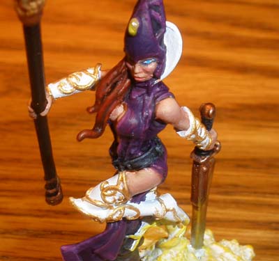
But... he wanted the hair to look a certain way and that's how I got into explaining this technique to him. The shadows in the hair were a bit of a brown color and the highlights were more of a red. I tried to explain how I would get that effect on the model. That's his model at the top of the post showing how he put all this to use.
If he'd just gone the standard route, he wouldn't have been able to get the variety in colors he wanted and he would have ended up close, but not really there in terms of a match. Using an approach like this can help you get more color into a model and get those subtle variations and shifts in color that you just can't get by using one color and a wash.
Some really, really simple color theory stuff
Before we get started though, we have two things we need to make sure everyone understands so we can use the terminology throughout and we don't lose anyone.
The two things are HUE and VALUE.
Colors can be thought of as having both a hue and a value.

Hue is the correct way to describe the color itself, red, orange, yellow, green, etc.
In the case of different brands of paint, the colors or more appropriately, the hues are called cool sounding things like "Scab Red, Dheneb Stone, etc."

Value is the relative lightness or darkness of a particular hue.
Think of value as a scale of 0 to 10. White would be "0" and black would be "10" and each hue will have it's own individual value somewhere on that scale. We can find a hue's value by converting it into a grey and seeing where it falls on that scale.

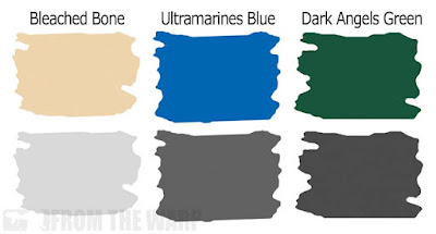
Looking at the few colors I picked above, we can see that each one is a different hue and has a different value (when converted to grey). Bleached bone is a particular hue and it has a particular value. These are not going to change unless we do something to the paint like mix in another color that will change the hue, the value or both.

We say the value of a certain hue is relative because it depends on what the hue is compared to. Bleached Bone's value is "light" when compared to Ultramarine Blue's value, but put Bleached Bone next to Skull White and now it's value appears a bit darker. Bleached Bone's value hasn't changed, it's just relative to what's around it.
Real simple, hue and value. Now that we have that out of the way, let's look at the practical application of highlighting with a different color.
The actual process of highlighting with a different color
Now that we're determined to get more color into our model and introduce some great color variations, the real trick is in getting and using the correct colors.
It all comes down to this...
If you want to change your hue, you need to have the same value.
So let's look at a real world example of what I mean then. Nick went through the process using this Eldar weapon as his test piece before starting work on the hair on his model. The goal was to have a rich brown shadow color with a nice red highlight color.
The base color is GW Vermin Brown. From there it was washed once with GW Devlan Mud and once with Baal Red. This gave us the starting point and created the dark brown that Nick wanted in the recessed areas of the hair.

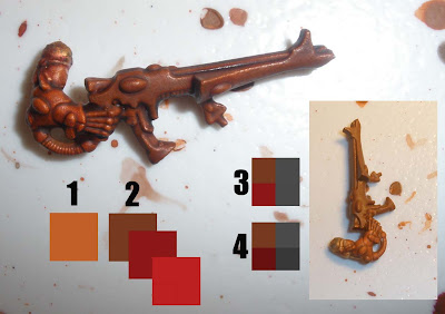
The numbers below correspond to the numbered blocks in the picture. The inset picture of the weapon is what it looked like prior to the Devlan Mud and Baal Red washes.
1. This color block represents the color we started out with (Vermin Brown). It may be off slightly because I sampled it from the photo.
2. This color block (the back one) is the color we ended up with after adding the Devlan Mud and Baal Red wash. Both the hue has changed and so has the value due to the washes. It's hue went from an orange to more of a brown. It's value also got darker. This is the color we are going to try and match in terms of value but change the hue from here on out.
The next two offset color blocks in number 2 are possible highlight choices:
If you look at the first offset (the middle block) color patch, you can see that this color is more "red" meaning it's hue has changed, but we don't know about the value.
The second offset (the front block) color patch is another red, a bit lighter, but we don't know about the value of this one either just yet.
Before we can pick the correct red from the two offset color blocks in number 2, we need to look at just their values and how it compares to our base color value (the Vermin Brown that has been washed).
3. This one shows the correct red we would use. It's a duplicate of the first offset (the middle block) color patch in number two. If you look at the upper left quadrant, you can see our created brown color we are trying to match in terms of value.
The lower left quadrant shows the new hue (the red we want to use). The right hand side shows both colors if we remove the hue and all that remains is the value alone. You can see the upper right and lower right quadrants almost match exactly in terms of value. They are the same grey.
This means we can paint this particular "red" right over our gun and it would look as though we have a red gun that shifts in color to a nice brown and then to a dark brown in the shadowed areas.
4. This is not the other offest block in number 2, but what would happen if we used a wrong "red". The upper left quadrant is our created brown color again. The lower left is a new red we thought might work but it turns out to be too dark. How do we know for sure?
If we look at the right half of the square, we can see both colors with the hue removed and the values are different. If we were to use this color, we would be adding a color that is too dark to pull off the change that we want. We would look as though we are adding another shadow color to the model instead of trying to just alter the color and create a highlight.

Nick's use of this technique on his model
So how do we apply it?
We take the correct "red" that has the hue we want and is the same value as our created brown and do a nice line highlight. Just like you'd do a regular line highlight on a model.
This color will not have the variation that the brown has and it will be a bit cleaner (because we did not create it by shading) and so it will appear to show the viewer the actual color of the piece in question.
We get to keep our nice, rich colored shadow areas and add a slightly different highlight color to give the hair a unique look. It looks like it's now red, but has some rich brown shading to it.
In the end
This is a fairly big post for a small idea. The whole thing boils down to understanding the idea of value and learning how to match the different values that come with different colors.
Is this an approach you'll use on every model? Nope.
It's a case specific thing. I used it extensively on a Deathwing squad recently. The idea was again to keep the values consistent, but alter the hues to make the armour look as though it was lit under a certain style of lighting.
You don't always have to use your base color or just a "lighter version" of it when it comes to highlighting. With a little bit of work and understanding of value, you can shift your highlights around and create some really cool color combinations.
You can see how Nick did with his model here after trying this approach in order to get a subtle change in the highlights on one of his models.
